
All the World’s Carbon Emissions in One Chart

All the World’s Carbon Emissions in One Chart
Two degrees Celsius may not seem like much, but on our planet, it could be the difference between thriving life and a disastrous climate.
Over two centuries of burning fossil fuels have added up, and global decision-makers and business leaders are focusing in on carbon emissions as a key issue.
Emissions by Country
This week’s chart uses the most recent data from Global Carbon Atlas to demonstrate where most of the world’s CO₂ emissions come from, sorted by country.
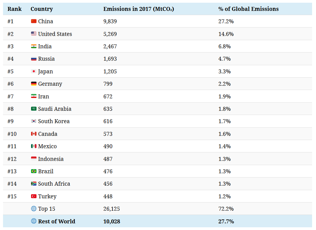
In terms of absolute emissions, the heavy hitters are immediately obvious. Large economies such as China, the United States, and India alone account for almost half the world’s emissions. Zoom out a little further, and it’s even clearer that just a handful of countries are responsible for the majority of emissions.
Of course, absolute emissions don’t tell the full story. The world is home to over 7.5 billion people, but they aren’t distributed evenly across the globe. How do these carbon emissions shake out on a per capita basis?
Here are the 20 countries with the highest emissions per capita:
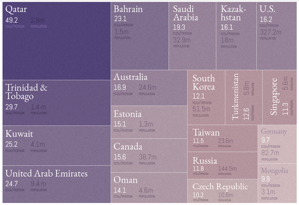
Source: Global Carbon Atlas. Note: We’ve only included places with a population above one million, which excludes islands and areas such as Curaçao, Brunei, Luxembourg, Iceland, Greenland, and Bermuda.
Out of the original 30 countries in the main visualization, six countries show up again as top CO₂ emitters when adjusted for population count: Saudi Arabia, the United States, Canada, South Korea, Russia, and Germany.
The CO₂ Conundrum
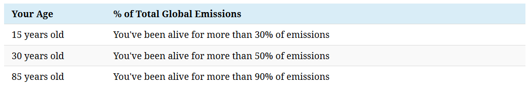
We know that rapid urbanization and industrialization have had an impact on carbon emissions entering the atmosphere, but at what rate?
Climate data scientist Neil Kaye answers the question from a different perspective, by mapping what percentage of emissions have been created during your lifetime since the Industrial Revolution:
Put another way, the running total of emissions is growing at an accelerating rate. This is best seen in the dramatic shortening between the time periods taken for 400 billion tonnes of CO₂ to enter the atmosphere:
First period: 217 years (1751 to 1967)
Second period: 23 years (1968 to 1990)
Third period: 16 years (1991 to 2006)
Fourth period: 11 years (2007 to 2018)