
The $86 Trillion World Economy in One Chart

The $86 Trillion World Economy in One Chart
The world economy is in a never-ending state of flux.
The fact is that billions of variables — both big and small — factor into any calculation of overall economic productivity, and these inputs are changing all of the time.
Buying this week’s groceries or filling up your car with gas may seem like a rounding error when we are talking about trillions of dollars, but every microeconomic decision or set of preferences can add up in aggregate.
And as consumer preferences, technology, trade relationships, interest rates, and currency valuations change — so does the final composition of the world’s $86 trillion economy.
Country GDPs, by Size
Today’s visualization comes to us from HowMuch.net, and it charts the most recent composition of the global economic landscape.
It should be noted that the diagram uses nominal GDP to measure economic output, which is different than using GDP adjusted for purchasing power parity (PPP). The data in the diagram and table below come from the World Bank’s latest update, published in July 2019.
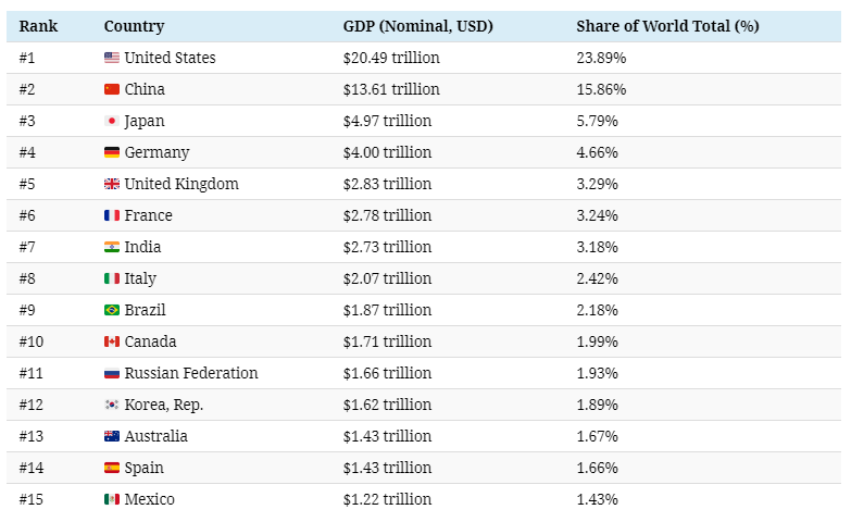
The above 15 economies represent a whopping 75% of total global GDP, which added up to $85.8 trillion in 2018 according to the World Bank.
Most interestingly, the gap between China and the United States is narrowing — and in nominal terms, China’s economy is now 66.4% the size.
A Higher Level Look
The World Bank also provides a regional breakdown of global GDP, which we helps to give additional perspective:

The organization breaks it down by income levels, as well:

The low income countries — which have a combined population of about 705 million people — add up to only 0.6% of global GDP.
Looking Towards the Future
For more on the world economy and predictions on country GDPs on a forward-looking basis, we suggest looking at our animation on the Biggest Economies in 2030.
It is worth mentioning, however, that the animation uses GDP (PPP) calculations instead of the nominal ones above.